Introduction
In today’s data-driven world, the ability to visualize data effectively is crucial for making informed decisions. Power Apps, a versatile tool in the Microsoft Power Platform, allows users to create custom applications with ease. One of its standout features is the ability to enhance data visualization through charts. In this blog post, we’ll explore how you can leverage charts in Power Apps to improve your data visualization, following SEO guidelines to ensure the content reaches the right audience.
Why Data Visualization Matters
Data visualization is more than just creating pretty charts; it’s about transforming complex data into actionable insights. When done right, data visualization helps in:
- Simplifying complex data
- Identifying trends and patterns
- Enhancing data storytelling
- Facilitating decision-making
Power Apps: A Quick Overview
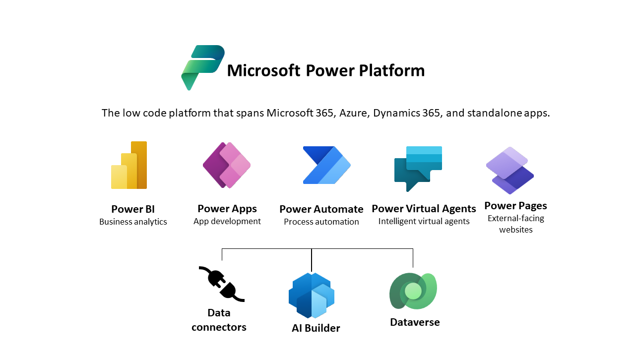
Power Apps is a suite of apps, services, connectors, and a data platform that provides a rapid development environment to build custom apps. Whether you’re a seasoned developer or a business user with minimal coding experience, Power Apps offers a way to quickly create applications that meet your specific needs.
Types of Charts in Power Apps
Power Apps supports a variety of chart types, each suited for different data visualization needs. Here are some common types:
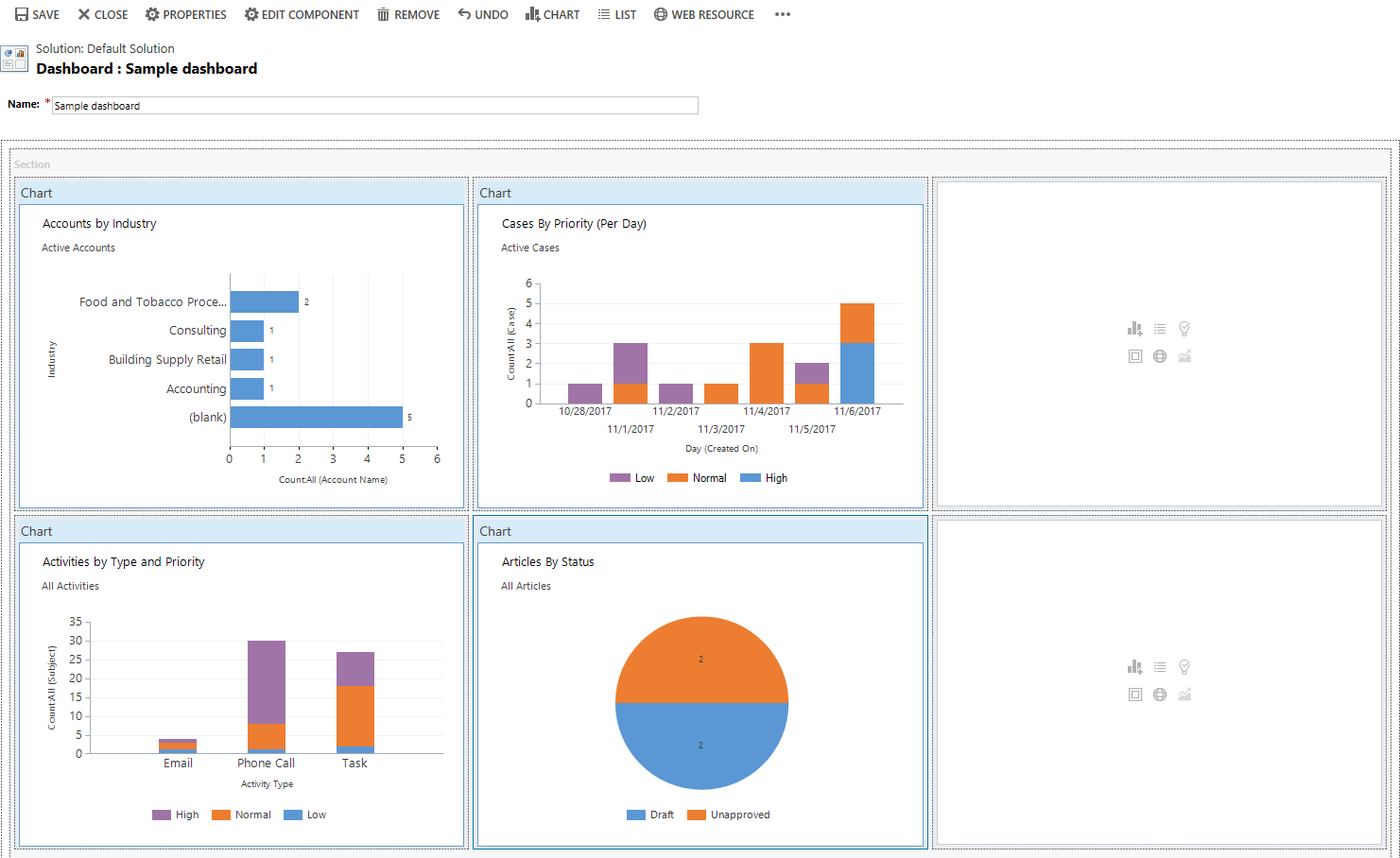
Column Charts
Column charts are ideal for comparing different categories of data. They are simple to understand and can display data changes over a period.
Line Charts
Line charts are perfect for showing trends over time. They are often used in time-series data to highlight data progression.
Pie Charts
Pie charts are best for showing proportions and percentages. They provide a clear visual representation of parts to a whole.
Bar Charts
Bar charts are similar to column charts but are oriented horizontally. They are useful when comparing data across multiple categories.
How to Create Charts in Power Apps
Creating charts in Power Apps is straightforward. Here’s a step-by-step guide:
- Open Power Apps Studio: Start by opening Power Apps Studio and selecting the app where you want to add the chart.
- Add a Data Source: Connect your app to the data source that contains the data you want to visualize.
- Insert a Chart Control: In the insert menu, choose the type of chart you want to add (column, line, pie, bar).
- Configure the Chart: Bind the chart to your data source and configure the properties to display the data correctly.
- Customize the Appearance: Use the properties pane to customize the chart’s appearance, including colors, labels, and tooltips.
Best Practices for Data Visualization in Power Apps
To make the most of your charts in Power Apps, consider the following best practices:
- Choose the Right Chart Type: Select a chart type that best represents your data and the insights you want to convey.
- Keep It Simple: Avoid cluttering your charts with too much data. Focus on key metrics and insights.
- Use Consistent Colors: Use colors consistently to represent the same categories across different charts.
- Label Clearly: Ensure that all axes, data points, and legends are clearly labeled.
- Provide Context: Add contextual information such as titles and descriptions to help users understand the data.
Readmore : creating no code and low code solutions with power apps
Benefits of Using Charts in Power Apps
Integrating charts into your Power Apps can bring numerous benefits, including:
- Improved Data Understanding: Visualizing data helps users understand complex information quickly.
- Enhanced User Experience: Interactive charts make apps more engaging and user-friendly.
- Better Decision-Making: Clear data visualizations enable better insights, leading to informed decisions.
SkySoft Connections: Your Partner in Power Apps Development
At SkySoft Connections, we specialize in helping businesses harness the power of Power Apps for data visualization and more. Our team of experts can guide you through every step of the process, from app development to data integration, ensuring that you get the most out of your Power Apps investment.
Conclusion
Enhancing data visualization with charts in Power Apps is a powerful way to make data-driven decisions and improve user experience. By following best practices and utilizing the capabilities of Power Apps, you can transform your raw data into compelling visual stories.
Ready to take your data visualization to the next level? Contact SkySoft Connections today and let us help you unlock the full potential of Power Apps for your business.
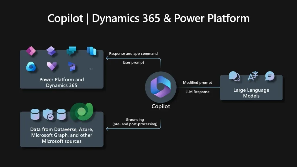
Readmore : what are the key features of dynamic crm with copilot
FAQ’s
In Power Apps, you can create a variety of charts including column charts, line charts, pie charts, and bar charts. Each type of chart is suitable for different data visualization needs and helps in representing data effectively.
To integrate charts into your Power Apps, follow these steps: open Power Apps Studio, add a data source, insert a chart control, configure the chart to display your data, and customize the chart’s appearance using the properties pane.
Using charts in Power Apps improves data understanding, enhances user experience, and facilitates better decision-making. Charts help transform complex data into clear, actionable insights, making it easier for users to grasp and act upon information.
![]() is a software solution company that was established in 2016. Our quality services begin with experience and end with dedication. Our directors have more than 15 years of IT experience to handle various projects successfully. Our dedicated teams are available to help our clients streamline their business processes, enhance their customer support, automate their day-to-day tasks, and provide software solutions tailored to their specific needs. We are experts in Dynamics 365 and Power Platform services, whether you need Dynamics 365 implementation, customization, integration, data migration, training, or ongoing support.
is a software solution company that was established in 2016. Our quality services begin with experience and end with dedication. Our directors have more than 15 years of IT experience to handle various projects successfully. Our dedicated teams are available to help our clients streamline their business processes, enhance their customer support, automate their day-to-day tasks, and provide software solutions tailored to their specific needs. We are experts in Dynamics 365 and Power Platform services, whether you need Dynamics 365 implementation, customization, integration, data migration, training, or ongoing support.